

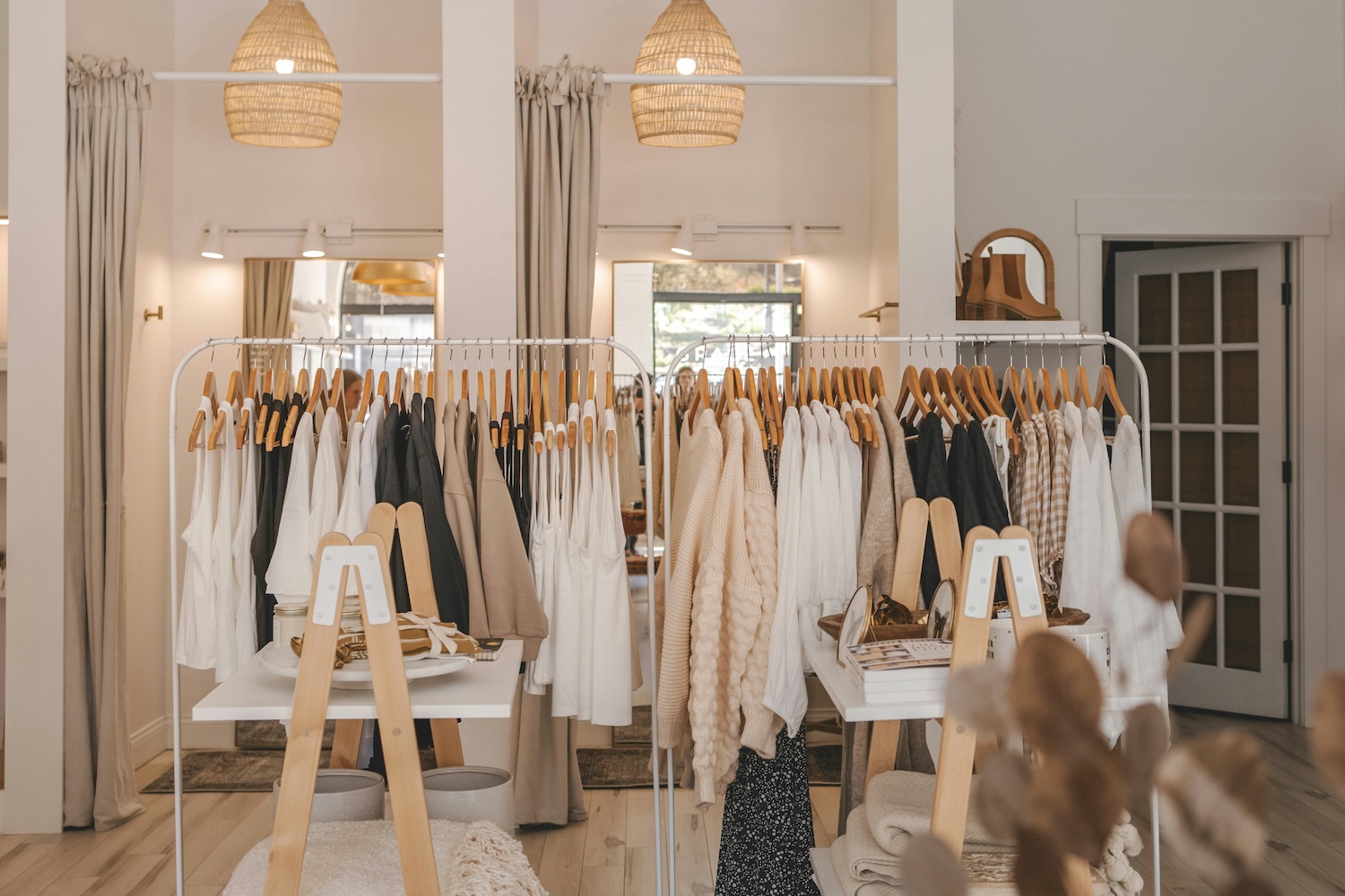


There’s a menswear shop I keep coming back to as an example, and I can never remember a single thing about its fixtures. What I remember is the light. The front third is bright and busy, the way a shop window should be. Then you move deeper and it drops, gets warmer, quieter, and by the time you’re at the back you’ve slowed to a crawl without deciding to. That’s not an accident. Somebody drew that gradient on purpose, and it’s doing more for the till than the fixtures ever will.
Retail keeps talking about lighting as a cost. Wattage, running hours, the standing charge. All real, all somebody’s problem. But it buries the more interesting fact, which is that the light is quietly bossing the customer about from the moment she walks in. How fast she moves. Where she stops. What she reaches for. Whether the coat in her hand reads as two hundred pounds or forty.
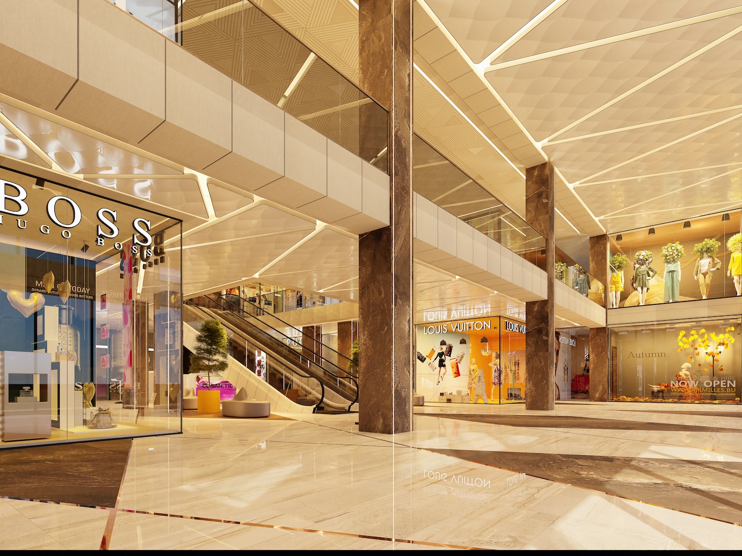
Fast light and slow light
Cool, even, bright. That’s the light of somewhere you’re meant to leave quickly. The supermarket run, the chemist, the phone shop by the ring road. There’s nothing for the eye to snag on so nobody’s eye snags, and people cross the floor at a march.
Warm and low does the opposite job. It talks people into staying. A café counter under soft amber has customers hovering over the pastries a beat too long. A homeware shop that pulls the light down over its centre tables is buying itself those few seconds where somebody plants their feet and starts touching the stock. Seconds like that are the whole business. Dwell time is where the money is, and next to nobody buys anything at walking pace.
Which is why a shop wants both. Brisk through the dead ground by the entrance, unhurried where the good margin sits. Plan the two speeds and the floor does half your selling for you. Leave everything on one flat level and you’ve flattened the selling with it.
What the wrong colour does to your stock
Colour temperature is the setting nobody touches and the one that shifts perception hardest. Down around 2700K to 3000K the light runs warm, it’s kind to skin, it takes the edge off a room. That’s your fashion, your beauty hall, your hotel bar. Take it up towards 4000K and past it and the whole thing goes crisp and slightly surgical, which is what you want over electronics, or a make-up counter where the colour on the back of a hand has to be honest.
The cost of getting it wrong is easy to miss because it’s silent. Warm light over a white shirt can grey it off. Cold light over a walnut tabletop pulls all the warmth out of the grain until a proper piece of furniture looks like something from a flat-pack box. The customer can’t tell you what went wrong. It just felt cheap and she moved on.
The greengrocer worked all this out generations ago. There’s a reason the tomatoes look redder under the shop light than they ever will at home. Every category could steal that trick. Hardly any bother.
Pointing the eye
Flat overhead light is scrupulously fair. Same on every square metre, which means it says nothing about where to look first, and that’s a waste, because the retailer almost always has a strong view on exactly that.
Accent light is how you say it. A tighter, harder beam on the thing you want seen drags the eye across the way a spot drags it on a stage. Put a decent multiple of the room’s light level on the front mannequin, or the new bag up on its plinth, and shoppers walk to it unprompted. No arrow, no sign. Brightest thing wins, every time, so the real decision is just which thing you’re prepared to make brightest.
Task light is the less glamorous cousin and it earns its keep by removing irritations. The fitting-room mirror. The counter at the till. The shelf edge where somebody’s holding two boxes up against each other. Skimp on those and you’ve stitched little frictions into the trip, the kind that lose you sales you’ll never even watch walk out.
Build it in layers
Shops that feel expensive almost never run off a single ceiling grid. They stack the light. A base layer to see by, accent picking out the heroes, task where the graft happens, and a bit of decorative on top for character. Stack those and you get depth. Shadow starts carrying meaning. The room stops looking lit and starts looking made.
Flat-lit, there’s no pecking order. Everything shouts at once, which the ear hears as nobody shouting. Done right, layering is how a small independent ends up feeling more considered than a chain that spent three times as much fitting the place out.
When the light is the brand
Past a certain point the lighting stops serving the stock and becomes the brand. Statement light, the piece hung to be looked at rather than to see by, has quietly turned into one of the busiest workers in experiential retail. The independents clocked it years before the big names did.
Neon’s the plain example. A custom sign across the back wall of a boutique. A glowing bit of script over a coffee hatch. A bright graphic jammed in the corner of a weekend pop-up. These have become the single most photographed corner of the modern shop. Customer takes the shot, sticks it up, tags the location, and the brand collects reach it never paid a penny for. One wall running a small ad campaign every Saturday off no media budget at all.
Do read up on the material before you spec it. Old glass neon and the newer LED neon don’t match on brightness, on running cost, or on the shapes they’ll bend to, and which one suits comes down to where the piece hangs and how hard it’s got to graft. A feature wall holding up the whole store concept is a different brief entirely from a quiet little sign behind the till. Same purpose underneath, though. Not to light the goods. To lodge the place in someone’s memory, and memory is what keeps brand recall ticking over long after she’s out the door and down the road.
Where to start
The people getting proper value out of light treat it as a design job and not a wiring one. Walk the floor at the customer’s eye line, never the sparky’s. Hunt out the patches where the light’s gone dead and lifeless. Ask what each zone is supposed to feel like before anyone gets round to counting fittings.
Set the pace zone by zone. Decide what the eye lands on first. Pick a colour that flatters what you’re selling rather than the empty ceiling above it. And leave the place one thing worth photographing. Light is about the cheapest thing on the floor for changing how a shop feels, and it stays the one most retailers never really lay a hand on.