
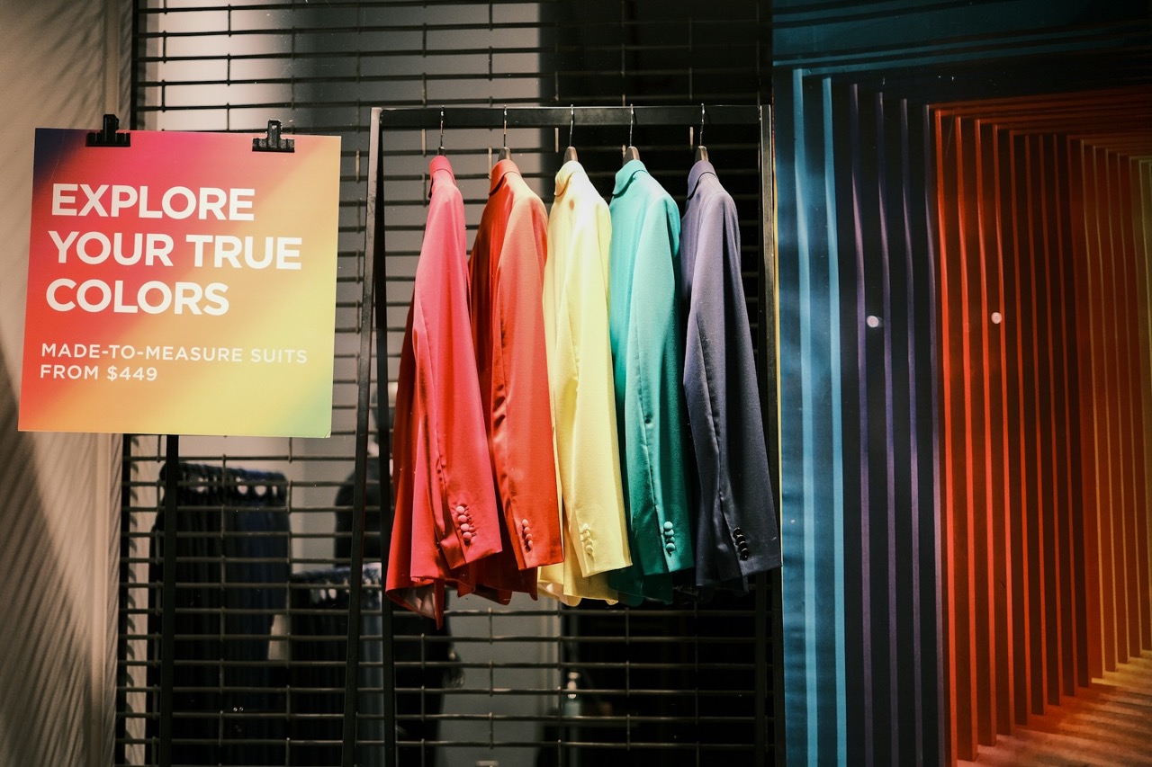
Step into a flagship on Oxford Street or a pop-up in Manchester and the same truth applies: what shoppers see first shapes what they do next. Visual cues, whether bold colour blocking, angled shelving, or lighting accents, are the quiet persuaders of retail. They do more than decorate space. They guide behaviour, build trust, and accelerate decisions.
At a time when physical and digital experiences are converging, the smartest retailers are borrowing lessons from industries that excel in visual persuasion. The goal is simple: reduce hesitation, focus attention, and move customers seamlessly from browsing to buying.
Lessons from Digital Platforms
Digital industries compete for attention every second, so their design strategies offer clear lessons for retail. The principles that work on screens translate remarkably well to shop floors.
Streaming services like Netflix rely on hero carousels and thumbnail previews to guide viewers quickly to featured titles. The platform does not overwhelm users with choices. It uses visual hierarchy to make decisions feel effortless. Social media apps such as Instagram and TikTok use colour accents and motion loops to draw eyes toward trending posts, creating predictable scroll patterns that keep users engaged. Online gaming platforms take a similar approach, using clear navigation menus, prominent security badges, and streamlined interfaces to make complex choices feel straightforward. Sites like UK online casinos not on GamStop demonstrate this particularly well, highlighting new game releases, time-sensitive promotions, and payment options through strategic use of icons and visual layering that builds immediate trust.
These examples prove that visual cues are not decoration. They are intentional design elements that direct behaviour and reduce cognitive load. Retailers can adapt the same thinking in physical spaces, using layout, signage, and lighting as non-verbal prompts that encourage movement and decision-making without relying on staff intervention.
Why Visual Cues Matter
Psychologists and retail designers agree that shoppers make instant judgments. Research shows people form impressions of credibility in less than a second, and once formed, these impressions prove difficult to shift. The same principle applies in-store. A cluttered window or crowded display can deter interest before a customer even crosses the threshold, while a clean focal point draws people in and invites exploration.
White space in digital design has its parallel in physical retail. Open sightlines and uncluttered displays create clarity and elevate premium products, allowing individual items to command attention rather than compete for it. UK trend reports consistently highlight how negative space, bold displays, and layered lighting improve dwell time and purchasing intent. Window displays, entrances, and interior layouts act as decision triggers, not just decorative choices. The most successful retailers understand that every visual element either guides the customer journey or creates friction within it.
Core Tactics for Retail Environments
Contrast and Colour Accents
Use bold backdrops or high-contrast zones to spotlight promotions or seasonal lines. A single bright display in a neutral setting becomes a visual magnet, drawing customers without extra signage.
Directional Flow
Angled shelving, lighting beams, or patterned flooring can guide the journey. Even product placement works as an arrow, subtly leading attention toward other items or deeper into the store.
Hero Displays
A clear focal point establishes hierarchy. Hero displays draw the eye, anchor navigation, and frame surrounding products, whether showcasing a new line or creating seasonal theatre.
Clarity in Signage
Typography and spacing must separate headlines from detail. Good signage persuades by answering questions quickly, while poor signage slows decisions.
Lighting and Depth
Spotlighting and layered backdrops create depth and make products stand out. Flat layouts fade fast, while dimensional presentation invites closer inspection.
People as Visual Cues
Staff are part of the design. Uniforms reinforce identity, and positioning near displays attracts attention. Gestures and presence act as live directional signals that complement the space.
Before and After: The Zara Method
Zara, the fast-fashion giant, provides a powerful case study by effectively removing traditional advertising from its budget. They spend minimal money on external campaigns, relying almost entirely on their stores to act as their primary communication channel and sales engine. Their visual strategy relies on two key cues:
- Window Displays as Hero Displays: Zara treats its windows not just as decoration, but as high-impact, constantly changing hero displays that announce the latest trends. This constant visual refresh drives high foot traffic and encourages weekly, rather than seasonal, visits.
- Scarcity and Directional Flow: Inside, racks are deliberately not overstocked. The minimalist aesthetic, high ceilings, and museum-like lighting present clothing as exclusive and high-value. This creates a psychological cue of scarcity, encouraging immediate decision-making by making customers believe the item may not be there tomorrow.
By using high-frequency visual change and intentional scarcity, Zara ensures that their physical space accelerates the shift from browsing to buying. The success of this model is undeniable, as they have become one of the world’s largest fashion retailers by using visual cues as a strategic replacement for multi-million-pound media campaigns.
Measuring Impact
Design decisions must be tested rather than assumed. Leading retailers use footfall tracking, dwell-time analysis, and sales data to quantify the effect of visual changes, treating store design as an ongoing experiment rather than a fixed installation. Online, A/B testing of thumbnails or call-to-action buttons delivers the same clarity, allowing brands to understand which visual elements drive conversions.
Incremental change is the safest approach. Alter one cue at a time, observe the outcome through data rather than intuition, and refine based on evidence. Overuse of competing signals creates visual noise that cancels out individual elements, so balance is as important as creativity. The goal is clarity, not complexity.
Moving Forward
Visual cues are silent but decisive. From streaming platforms to social media to gaming sites, consumers are trained to follow design signals that direct attention and build trust. Retailers who treat their environments with the same intentional care can transform shopping from a transactional experience into a curated and compelling journey.
The opportunity in 2025 and beyond is not to add more choice, but to use visual signposts that make choice feel simple, intuitive, and enjoyable. The retailers who master this will find that the quietest persuaders often prove the most powerful.