


Entertainment retail venues thrive when every visual cue helps visitors move confidently from one area to the next. Thoughtful signage and visual merchandising turn a simple visit into a layered experience, where people linger longer, discover more and leave with a stronger sense of satisfaction. The same principles that shape physical customer paths also appear in the way people explore digital leisure options, including online casinos that rely on clear layouts and inviting imagery to keep users engaged.

Setting the Scene at the Entrance
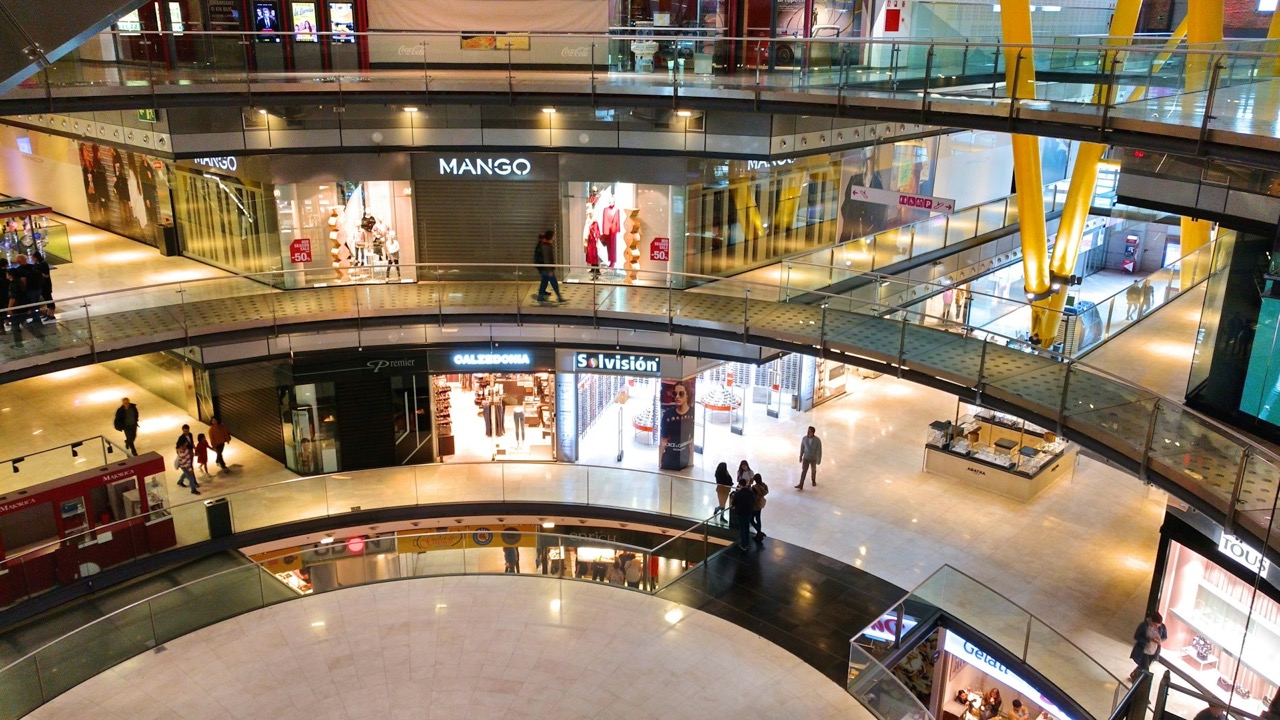
The first moments inside an entertainment venue set the tone for everything that follows. Large, well-lit directional signs placed at eye level immediately orient newcomers, reducing hesitation and inviting them to step forward. Subtle colour accents on these signs echo the venue’s overall palette, creating a sense of continuity rather than abrupt change. When the entrance feels welcoming rather than overwhelming, visitors begin their journey with curiosity intact. Staff often notice how first impressions influence whether guests choose to explore side areas or stick strictly to the main route. Adding small details such as seasonal imagery or gentle lighting variations can further soften the transition from outside bustle to indoor calm. Over repeated visits these familiar cues build a quiet sense of belonging that encourages longer stays and repeat trips. Many managers also find that incorporating local artwork or subtle soundscapes near the doors helps bridge the gap between street energy and the venue’s calm interior atmosphere.
Wayfinding That Mirrors Natural Movement
Effective wayfinding works best when it follows the way people already tend to walk. Curved arrows on floor graphics gently steer crowds toward popular attractions without feeling forced. Overhead signs repeat key destinations at regular intervals so no one needs to backtrack. This approach keeps foot traffic flowing smoothly and prevents the frustration that arises from unclear routes. Retailers notice that well-planned signage reduces dwell time at decision points, allowing the overall visit to feel more relaxed. In practice, teams test different arrow styles during quieter hours to see which shapes prompt the smoothest turns. Visitors rarely realise how much these subtle prompts shape their route, yet the result is a journey that feels intuitive rather than directed. Observing peak times reveals that slight tweaks to arrow spacing can ease bottlenecks near popular kiosks without drawing attention to the changes themselves.
Colour Stories That Build Atmosphere
Colour choices in signage do more than decorate; they shape mood and pace. Warm tones near food outlets encourage people to pause, while cooler shades along walkways promote steady movement. When these hues repeat across different zones, the space begins to feel cohesive. Visual merchandising teams often test small adjustments in colour intensity to see how they affect dwell times at displays. Over time, these refinements create an environment where every section feels distinct yet connected. Retail Shoppability research shows that consistent visual signals increase the likelihood of unplanned stops along a route. shoppability research findings further confirm that balanced palettes help maintain energy levels throughout longer visits, turning routine trips into more enjoyable outings. Seasonal shifts in lighting temperature can also refresh these effects without requiring new signage installations.
Displays That Invite Interaction
Merchandising displays positioned at natural stopping points turn passive walking into active exploration. Low-level units with clear product information let visitors examine items without blocking pathways. Interactive screens built into larger signage can highlight special features or upcoming events, adding another layer of discovery. The key lies in balancing information density so displays remain attractive rather than cluttered. When shoppers feel free to touch and linger, the journey gains memorable moments that extend beyond the initial reason for visiting. Many venues now incorporate scent or sound elements alongside visuals to deepen engagement at these spots. Staff feedback suggests that interactive elements also spark conversations between companions, extending dwell time without any extra prompting. Placing mirrors or reflective surfaces nearby often amplifies the sense of space and encourages people to pause a little longer.
Measuring Success Through Subtle Feedback
Venues increasingly observe how visitors respond to signage changes by tracking natural movement patterns. Heat-mapping tools reveal which areas draw attention and which signs go unnoticed. Adjustments then follow these insights, such as raising a sign that was previously hidden by seasonal décor or simplifying wording on directional panels. This ongoing refinement keeps the customer journey fresh without requiring complete redesigns. The process echoes the way physical retail spaces continually adapt to human behaviour. Regular reviews allow teams to spot emerging trends early, such as shifts in preferred routes during different times of day. Small iterative changes often prove more effective than large overhauls because they preserve the familiar while quietly improving flow. Sharing these observations across departments helps maintain consistency even when staff rotations occur.
Closing the Loop at the Exit
As visitors near the end of their route, signage gently prepares them for departure while offering a final invitation to return. Summary panels recap key experiences or highlight nearby events, creating a sense of completion. The same narrative thread that began at the entrance now resolves, leaving people with a coherent memory of their time inside the venue. When signage and merchandising work together across the full journey, the space feels less like a collection of separate zones and more like a single, unfolding story that encourages future visits. The Influence of Fashion Retailers on Customer Shopping Decisions: The Role of Visual Merchandising and Store Layout highlights how small layout tweaks can shift exploration patterns in noticeable ways. visual merchandising studies add weight to the idea that thoughtful exits can turn one-time guests into loyal regulars who look forward to returning.
