





Ask any retail designer where the customer experience begins and you’ll rarely hear “at the shopfront.” It begins further back — at the turn off the main road, the first glimpse of the sign, the hunt for a parking space, the walk from the car or the bus stop to the entrance. By the time a customer reaches the door, a good part of their impression is already formed, shaped by things that have nothing to do with the interior fit-out and everything to do with how the destination sits in its surroundings.
Yet retail projects are still routinely presented as if the building existed in isolation. A beautiful façade render, a polished interior concept, and very little about the approach, the arrival, or the relationship to everything around it. That gap matters, because the wider site context is where a surprising amount of the retail experience actually lives. Aerial visuals are one of the more effective ways to close it — helping teams understand and communicate a development as a whole destination rather than a single storefront.
Retail Design Starts Before the Shopfront
The arrival sequence is a design problem in its own right, and it’s often the least considered. How does a customer approach — from a busy road, a transport hub, a pedestrianised street? Is the entrance obvious, or does it hide behind a poorly organised car park? Can the brand be seen from the roads that actually carry the footfall?
These questions shape the experience long before merchandising or store architecture come into play. The visibility of the entrance from key sightlines, the hierarchy between a main entrance and secondary ones, the way exterior signage reads on approach, the relationship between anchor tenants and the smaller units that depend on their pull — all of this is part of the design, and all of it happens outside the shopfront. Treating the store as though it starts at the threshold ignores the half of the customer journey that determines whether they arrive receptive or already frustrated.
Aerial Context Shows the Whole Destination
This is precisely where a top-down view earns its place, because so many of these relationships are only legible from above. A ground-level render shows you a handsome entrance; it doesn’t show you how that entrance relates to the car park, the pedestrian crossings, the neighbouring units, and the routes people actually take.
For retail parks, shopping centres and mixed-use destinations, aerial rendering can help teams show how the building, entrances, parking, public realm, pedestrian routes and surrounding streets work together before the project is presented to stakeholders. Seeing the site as a whole — the store position, the servicing zones, the landscaping, the connections between multiple buildings — turns an abstract masterplan into something everyone in the room can read. It’s the difference between describing how a destination works and simply showing it.
Shopping Centres Need a Clear Arrival Story
Shopping centres live or die on their arrival story, because they’re asking customers to choose them as a destination rather than stumble into them. The main entrance has to command attention. Secondary entrances need to work without cannibalising the primary one. Transport access, car park orientation, and the walk from either into the retail core all shape whether the centre feels welcoming or like a puzzle to solve.
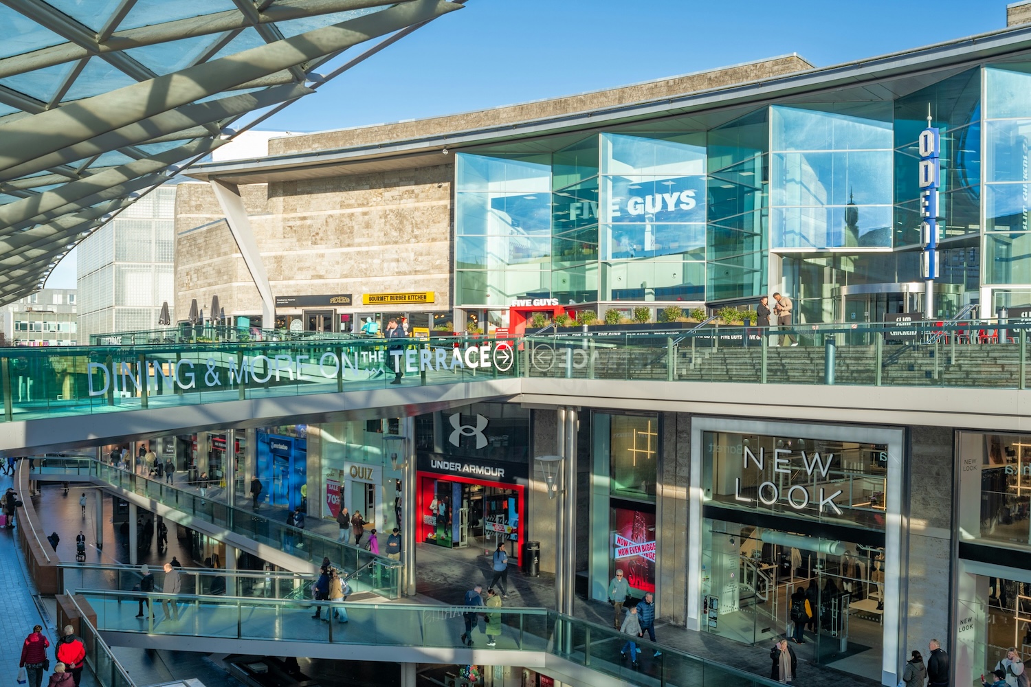
Recent redevelopment work across the sector shows how much of this now centres on the approach and the public-facing edges — mall entrances reworked for visibility, landscaping and biodiversity brought to the fore, outward-facing restaurant venues designed to activate the perimeter and extend trading into the evening. None of these moves make sense viewed as isolated elements. They’re about how the whole destination presents itself to an arriving customer, which is exactly what an aerial perspective is built to communicate.
Mixed-Use Retail Can’t Be Planned Store by Store
The moment retail sits within a mixed-use scheme, store-by-store thinking breaks down entirely. Now there’s residential above the shops, leisure uses drawing a different crowd at different hours, restaurants that peak in the evening, offices that empty at six, public plazas that have to work for all of them, and shared circulation that has to knit it together.
Add the unglamorous but essential layer — deliveries, servicing, waste, the back-of-house routes that keep the whole thing running — and the complexity multiplies. A single storefront view tells you almost nothing about how a scheme like this actually functions across a day and a week. The value of an aerial, whole-site perspective rises sharply here, because the success of the retail depends on how it’s woven into everything around it, and that weave is only visible from above.

Visual Communication Aligns Stakeholders
A retail development gathers an unusually diverse set of stakeholders around the same project, and they care about very different things. The landlord watches leasing and rental value. Tenants care about brand visibility and footfall. Planners scrutinise access, servicing, and public realm. Investors want the commercial story. Contractors need to understand what’s actually being built. Each reads the project through their own priorities, and misalignment between them is where retail schemes stall.
Studios such as ArchiCGI can support this process by turning architectural plans, site information and retail design intent into visuals that are easier for landlords, brand teams, planning stakeholders and leasing teams to review. When everyone is looking at the same clear representation of the destination — rather than each interpreting a set of drawings through their own lens — the conversation improves. Objections become specific. Trade-offs become visible. And the scheme moves forward on shared understanding rather than a series of separate assumptions that only collide later.
Store Rollouts Benefit From Contextual Thinking
Even a single-store perspective changes when you think contextually, which matters enormously for brands rolling out a concept across many sites. A flagship on a prime high street, a unit in an enclosed mall, and a box on a retail park are three completely different arrival experiences, and a concept that ignores those differences delivers an inconsistent brand experience.
The publication’s coverage of brand-led store concepts — the way identity, store architecture, and in-store experience are engineered to work together — underlines how carefully considered this has become. Extending that care to the site context is the logical next step. The same concept needs to adapt its entrances, signage, and approach to the specific conditions of each location while keeping the brand experience recognisable. Understanding each site’s context, rather than dropping an identical template onto wildly different surroundings, is what keeps a rollout coherent.
Public Realm Shapes Dwell Time
The space between and around stores does real commercial work, because it governs how long people stay. Comfortable seating, planting, shade, considered lighting, outdoor dining, and well-designed routes between stores all encourage customers to linger — and dwell time is closely tied to spend.
The strongest retail destinations blur the line between retail and leisure through their public realm, giving people reasons to stay beyond the transaction. Designed well, a plaza or a landscaped route isn’t dead space between shops; it’s part of what makes the destination somewhere people choose to spend an afternoon rather than a quick errand. Seeing how these spaces connect the retail offer — how the pedestrian comfort and the transitions actually flow — is far easier from an aerial perspective than from a sequence of ground-level views.
Aerial Views Clarify Operational Reality
Beyond the customer-facing story, an aerial perspective is genuinely useful for the operational constraints that make or break a scheme’s practicality. Delivery routes, loading bays, waste collection, staff access, back-of-house circulation, fire access, security sightlines, crowd movement at peak times, event logistics, construction phasing — these unglamorous realities determine whether a beautiful design can actually operate.
Showing them clearly serves the retail property professionals whose job is to make the destination work day to day, not just look good in a brochure. A scheme that reads beautifully at ground level but hides its servicing is a scheme with problems waiting to surface, and an honest aerial view brings those questions into the open early, when they’re still cheap to solve.
Sustainability Should Be Visible at Site Level
Sustainability in retail is increasingly judged at the scale of the whole site, not just the fit-out, and it deserves to be represented honestly at that level. Green roofs, biodiversity, planting, shaded pedestrian routes, cycle parking, genuine public transport access that reduces car dependency, the reuse of existing structures — these are site-level decisions, and they’re visible from above in a way a storefront render can’t capture.
With sustainable store design now a fixture of industry debate, showing these commitments clearly and truthfully matters. The caution is against greenwashing: the aerial visual should represent the real environmental moves, at real scale, rather than draping token greenery over a scheme to imply a sustainability it doesn’t possess. A design-literate retail audience sees through the difference quickly.
Common Mistakes in Retail Site Presentations
The recurring errors are worth naming: showing the store without its surroundings; ignoring how customers actually arrive; hiding the service access rather than solving it; lavishing attention on the façade while barely explaining the public realm; omitting parking and pedestrian routes; failing to communicate which tenants sit next to which; and, most commonly, presenting visuals that look attractive but never explain how the destination actually works.
A Checklist for Retail Aerial Visual Planning
Worth confirming before a retail site presentation: Are the main and secondary entrances clear? Are customer arrival routes shown? Is parking or transport access visible? Are the anchor tenants and key adjacencies understandable? Is the public realm included? Are restaurant terraces and outdoor leisure areas represented? Are delivery and service routes accounted for? Does the visual explain how the destination shifts from day to night? Are the sustainability elements shown honestly? And crucially — can a non-design stakeholder grasp how the site works at a glance?
Retail design was never only about what happens inside the store. It’s about the route to it, the context around it, and the destination experience that frames every visit. When retail teams communicate that wider site story clearly, they make sharper decisions about access, visibility, placemaking, leasing, and the customer journey — and they bring landlords, tenants, and planners along with them. The shopfront still matters enormously. But the customer’s experience of it starts long before they reach the door, and the projects that understand this are the ones designing for the whole journey, not just its final step.